Showing posts with label Technique - Stencils. Show all posts

Friday, January 21, 2011

Happy Friday!

Hi Papercrafters.  I hope you all had a great week.  I have been busy getting things together for a tabletop sale at a local scrapbook store.  Out with the old, so I can get some new!!!   I wanted to remind you that today is Faith Art Friday over on the Layers of Color blog.  I hope you will take a moment to hop over there and be encouraged and uplifted.  What better way to wrap up your week!

The card I'm sharing today was created using one of the Layers of Color art stencils and gesso.


It was inspired by a call for Stampers Anonymous to use gesso.  I really like how the background turned out.  The gesso adds great texture.


Project Details
I started with a piece of patterned paper by Basic Grey.  It is from their Basics Manilla 6 x 6 paper pad. 
1.  Apply light modeling paste using the Botanical Swirls art stencil and let it dry overnight.  It warped the paper a little.  I used my iron (against the backside) to flattened it out again. 
2.  Rub ink over the raised modeling paste design.  I used VersaMagic Perfect Plumeria by Tsukineko. 
3.  Apply brown around the edges. ( I used acrylic paint, but you could use ink as well)
4. Stamp butterflies with Brilliance Pearlescent Chocolate by Tsukineko and cut out.
5.  Cut sentiment label using Spellbinders Labels 1 and ink edges with brown ink.  Stamp sentiment and adhere to panel.
6.  Adhere ribbon to front panel, wrapping ends around the edge of panel.
7.  Adhere panel to front of card.
8.  Add paper butterflies

Supply List
Stamp set : butterflies - Butterfly Collector art stamp set
sentiment - Hero Arts
Stencil - Botanical Swirls art stencil by Layers of Color
Patterned Paper : Basic Grey
Cream Cardstock : unknown
Gesso : Liquitex
Ink : Tsukineko Brilliance Pearlescent Chocolate
Paint : Making Memories
Ribbon : Crafts Etc
Lace - Unknown

I hope you will consider using gesso on your next project.   Let me know if you try it.  I'd love to see what you create!
Melisa

*********************************************
Making the world more colorful with Layers of Color!

Today is Faith Art Friday over at Layers of Color and we would like to invite you to check it out on the Layers of Color Blog!

Layers of Color is proud to be a Spellbinders Preferred Stamp Company and we all love and use the Grand Calibur!

You can now upload your LOC projects to our Flicker Group HERE, and find tons of inspiration.
And please join us on Facebook HERE.

Sunday, November 21, 2010

The Countdown has begun ...

Well the countdown to Thanksgiving has begun.  Do you have all your supplies/ingredients??  I'm ready ... I think.  I have to work monday-wednesday though.  So I want begin cooking til Thursday.  It's just my son, husband and myself here in Texas, so no rush.  It's my first thanksgiving without my daughter.  I will miss cooking with her.  But we still have so much to be thankful for!! 

So I think a couple of thank you cards are appropriate!


Stamps : Vintage Roses and Royal Birds clear art stamp sets
DP - Melissa Frances from my October Shabby Kit from Pixie Dust Paperie.  You can actually purchase the DP seperate from the kit now that they have moved on to the November kit. 
Glitter on the roses and the sticker label - Martha Stewart 
Sentiment rub-on - Pebbles Inc.
Colorization - Copics RV00, RV11, G000, G21, G24.
Challenges
Card Patterns - sketch
Create: - Thank You card
Tuesday Throwdown - buttons and bows
ABC Design Blog - faux sewing
Stampin' Royalty - Patterned Paper


I stamped this thank you card using Garden Wall Frame cling art stamp.  It's compatible with the Spellbinders Labels 14 die! 
I just love this image!


Lots to Do is looking for your favorite technique.

Stencil Technique with modeling paste
One of my favorite techniques right now is anything I do with my Layers of Color art stencils.  This particular stencil is Botanical Swirls.   For this card I used modeling paste.  So easy and adds so much dimension.  You want to use a thick cardstock or watercolor paper though or the paper may buckle a little.  After it drys just brush on some ink. 
CES wants us to use lace, one of my favorites!
And I LOVE it when I can find it in colors.  Another option is to by beige or white and spray is with color, paint it, or use your copic markers!

Creative Card Crew - thank you

Did you know that Layers of Color is on Facebook now!  We would love to have you stop by:
HERE

Well if you haven't started planning, then get busy!
Have a blessed week!

Friday, November 19, 2010

MIXED MEDIA / ART JOURNAL


Good Afternoon papercrafters.  On a previous post I shared with you that I had been inspired by the "Inspiration Wednesday" video's by Donna Downey.   Every wednesday Donna explores different techniques and ways to apply color.  She does this in her "inspiration journal".  You can view a list of all of them on her blog HERE.  I am enjoying learning about different ways to apply color. 


I have decided to display my "journal pages" on my 7 Gypsies Photo stand and will share these with you as I create them. 

So for this page I started with water color paper.  Apply a water down yellow acrylic paint.  I used a green water color crayon around the edges.  I just colored it on and then added a little water with a wet paint brush, blending with the yellow.  I wanted it a little lighter in the middle so I used some white acrylic paint here and there til I got the look I wanted.  Next I used my Layers of Color Natural Flourish art stencil .  So easy to use.  I applied VersaMagic Tea Leaves with this in 2 of the corners.  My butterflies and the floral center in the large flower are from "Flutterescent" and "Flowering Gem" clear art stamp sets by Layers of Color.  I needed a center for the flower so I started digging through my stash and found this neglected pack of metal brads.  Just big enough to fit.  To tie everything in, I decided to add some gold around the edge of my frame (really old as well) and butterflies.  I think the ruffled ribbon works great for the stem and leaves.  The quote is from Inspirational Quotes.
The font style is totally inspired by Donna.  To finish it off, I used a charcoal pencil around the edges.

Thanks for stopping by and have a wonderful weekend!

Wednesday, November 10, 2010

"Fruit of the Spirit" Blog Hop Day 3

Good Morning and welcome to Day 3 of the Layers of Color / 2 Sketches 4 You "Fruit of the Spirit" Blog Hop

I am off to work early this am and wanted to make sure my post was up, so please be patient while the other ladies get theirs up this morning.

Also playing along today:

If you missed my post monday where I explained what this hop is all about, then please scroll down. And remember that Layers of Color is sponsoring the 2 Sketches 4 You challenge blog this week. So hop on over and see what you have to do to qualify to win a free stamp set!


For this project I used Fruitful Harvest and one of the new release cling art stamps - Victorian Frame.  I also used one of Layers of Color's art stencils - Belle Brocade.  Did you know that Layers of Color is a Spellbinders Preferred Partner??  LOC has some awesome images that coordinate with Labels 14 and 16.  You can check the all out HERE.

You may have noticed that the coloring on the fruit is not my style.  I cased a card made by Layers of Color owner and artist, Laura Kirste Campbell.  I just love how she blends colors together in a way I would never come up with, so I decided to give it a try.  Isn't Laura's card below gorgeous!  She combined Fruitful Harvest with Acanthus Leaves and Her Majesty's Urns.  I just love how all of Layers of Color's stamps fit so well together!


Project Details

For my card today, I went with watercoloring for my colorization.   I used Strathmore Watercolor cold press paper.  I think the main thing I look for with watercolor paper is getting one as smooth as possible.  If there is too much texture, then your image want stamp properly.  The next decision when working with watercolor is ink.  Palette and Staz-on are water-proof.  Momento is not, but might work if you heat set it.  I'm not sure.   It took several attempts for me to get a good stamped image, because of the texture.  I have started using a linolium block that I picked up at a Michaels and I'm finding it is improving my stamping because the table I work on is not level in spots.  (see photo at bottom of post). 

There are alot of different choices for watercolor techniques, from very inexpensive sets to higher end water colors in tubes.  There are watercolor crayons and pencils.  I have tried all of these and the watercolor pencils are my least favorite now that I have tried them all.  In addition, some of the inks you use for stamping can be watered down and used.  Just smear some on a piece of acetate and add a few drops of water.  Mix it together with a paint brush and you are ready to go.  Not all stamp inks blend well with the water though.  Stampin' Up does not.  But my VersaMagic and Brilliant inks by Tsukinek work well for this.  There are also shimmery options.  You can use your Glimmer Mist, Shimmerz, or H2O Watercolors.  I own and have tried all of these.  For me it just depends on what color I'm looking for and the opacity.  Today I wanted a shimmery look, so I went with my Shimmerz.  I used Pumpkin, Lilac, Golden Wheat, and Green Olive.  I needed a lighter shade green as well so I used my Sage VersaMagic ink pad. 

I begin by lightly wetting the area I'm going to be working with.  Then I start adding color.  Have a paper towel on stand by.  If the color is to dark, blot it off.  I used my finger a few times to help blend the colors.

I'm not a watercolor expert and most of what I have learned was through trying the different products and just playing.  I love the softness you can get with the watercolors and it's so much fun to try different colorization techniques.  I would love to take a class some day.
I hope you will be inspired to give it a try!  If you choose to give it a try, I would love to see your work!

For the rest of the project:
I used cuticle scissors to cut around the image.  I stamped Victorian Frame on a lilac dp by K&Company.  I used Copics, G82 and G85 to color some portions of the image.  I used Labels 14, slightly smaller to fit inside the image and slightly larger to border the image, from beige paper, and a larger one from purple paper as well.  Adhere Victorian Frame to purple border, and adhere beige smaller cut to inside on top of image.  Adhere Fruitful Harvest image on top.  I put a couple of pop dots in the center of mine.  I stenciled Belle Brocade on lilac dp. 

I created my own little ruffle border using crepe paper.  That gorgeous lace is by Webster Pages.  It came in my October Pixie Dust Shabby Chic Kit.  You can check out all the wonderful projects on the Pixie Dust Paperie Blog.  You can check out these fun kits in The Pixie Shop HERE.  Not sure who make the green velvet. 

After inking edges assemble as shown.

I'm using mine for an upcoming birthday card I needed.


Thanks for stopping by and have a blessed day!

Some of the products used
My new stamp surface - Speedball Linolium, availabel at Michaels

used to apply ink with stencil 


 Shimmerz Paints
Spellbinders Labels 14


Saturday, September 25, 2010

Stencil Tutorial #2

Good Morning!  Today I want to share another stencil tutorial with you.  Did you know that Layers of Colors sells Art Stencils??  Gorgeous patterns!  You can check all of them out HERE.

Last week I shared a project using one of the stencils and modeling paste.  If you missed it, you can check it out HERE.

This week I want to share a card using a stencil and color sprays.  Another messy project, but worth the effort.  This background turned out so cool.


Supplies
White watercolor paper, Black VersaFine Ink (Tsukineko), Clear Embossing Powder (Stampendous), Memento Tuxedo Black, Glimmer Mist - Glimmer Mist Fully Purple, Lily Pad, Twighlight, Ink - Brilliance Pearlescent Crimson around the edges, Copic Markers, Stencil (background) - Layers of Color, Stamp set - "Under the Sea" and "Old World Flourish" - Layers of Color.


Technique : Stencil with Color Sprays

Use a circle cutter and cut watercolor paper / card.  Spray watercolor panel with twilight Glimmer Mist.  After dry lay stencil over watercolor paper ( I used stencil adhesive with mine).  Spray with Lily Pad and Fully Purple Glimmer Mists.
I just love how this background turned out.  And with all the choices for color sprays, the results are endless.  I am totally loving these stencils!!

After drying ... ink edges with Brilliance Pearlescent Crimson.  Stamp flourishes, sea grass, and coral with pigment and emboss with clear embossing powder on watercolor paper.  Adhere to front of card. Stamp shells, fish, and sea horse on white cardstock with Momento Ink and color using Copic markers. Cut these images out and adhere to front of card.

Glimmer Mist tip:  Do not shake up and down to mix.  Shake from side to side to help keep it from clogging up.

I hope you will try a stencil out on one of your projects!  If you do, leave me a link.  I would LOVE to see what you come up with!

More stencil techniques coming in the future.

I'm linking this one to the following awesome challenge blogs!
A Spoon Full of Sugar - "Anything Goes"
Creative Inspirations - 2 or more shaped images

Have a blessed weekend!

Friday, September 17, 2010

Altered Cigar Box


Last week I was searching for items I could use in my art, at a local antique store, and found this wonderful wooden cigar box for $2.50.  I also found some tiny bottle brush trees that I hope to use with a Christmas or winter scene in the future.  Pink Persimmon sells these adorable little chipboard houses, Vintage Colonial House by Melissa Frances and I have been wanting some.  Now I have to get them so I can use my little trees!!  Do you ever go to "antique stores" looking for great finds like these??  Not all of it is "antiques".  And you know what they say, "One man's junk is another man's treasure".  You have to be careful though.  Some of that stuff is priced crazy. 

I knew as soon as I seen the cigar box what I was going to do with it, because it has been one of those projects I've been planning on creating for a while.  I wanted to make a gift card set for my sweet mother-in-laws birthday in november and had been considering what I would store them in.


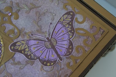
 I used "Butterfly Collector" and an art stencil - "Botanical Swirls",  by Layers of Color.


 If you have been following me for very long, then you know I LOVE butterflies.  And this set by Layers of Color is so gorgeous.  Especially that medallion.  Wanna see my butterfly shadow box I created earlier in the year??  Check it out HERE.  Sorry to get off subject, but it is one of my most favorite projects I have ever created and enjoyed seeing it as I walked through my diningroom this spring.  I even wrote a little poem to go with it with the intentions of creating a framed project using the poem, to set beside my butterfly box.  I'll have to add that next spring!

Tutorial
This project was a little messy to create, but worth it.  I could have just used patterned paper, but wanted more of a handmade, textured feel.  So, I created my own background. 


I honestly wasn't sure where I was going when I began the process and the end result was an accumulation of errors and layering color until I got the look I wanted.  So I will describe the process the best that I can, but know that what you should take from this is that sometimes you just have to sit down and play with color and mediums until you get the look you want.  My first panel turned out horrible.  But I learned from that and I'm very pleased with the results of my second panel. 

I started with a heavy cold pressed watercolor paper and trimmed to the size of the top of the box.  I watered down some acrylic paint, Making Memories Wisteria and brushed it over the paper.  I completely covered it with this wash and then let it dry.  Then I used my stencil to create some texture.  I used stencil adhesive, but the modeling paste is so thick, it might not be necessary.  Sorry, I haven't tested it.  With a palette knife (Just a plastic knife with a bent handle for easier handling.  Found in local craft store in the art section for about $1.  Well worth it, because that angled handled really helps) I spread light modeling paste (also found in the art section of local craft store) over the stencil.  Use the palette knife to level the paste and wipe off the excess.  Let this dry.  I really rushed mine and used a heat gun to help it along, because I had to move the stencil over to cover the entire panel.  You can see the raised area's created with the modeling paste a little better in this photo.


Next I realized I wanted two shades of purple.  So I used a stipple brush to pounce on another purple, Brilliance Pearlescent Purple.  These inks have just a little shimmer to them.  I inked up the Tim Holtz applicator tool with Pearlescent Chocolate and gently began adding it to the raised, modeling paste design.  Some of the ink got on the background, but that was ok.  I also distressed up the edges with it as well.  Then I decided I wanted to use gold as an accent, so I added a little gold pigment ink to the background.  It didn't really show up very well.  At this point I decided I had covered up too much of the lightest color purple I started with and began to pounce on some Brilliance Moonlight White to lighten some of the area's.  See how this process works, teehee.  And lastly I wanted the modeling paste swirls to stand out a little more. So I used a tiny paint brush and began adding Shimmerz Golden Wheat and Shimmerz Blingz Gold Glimmer here and there.  I didn't want to cover all of the swirls, because I wanted different shades.  By this time I had a mess and took a break to clean up the stencil / palette knife and my stipple brushes. 


I found a very old piece of DP in my stash by Colorbok that was a little lighter purple than the background.  I stamped my butterflies with Pearlescent Chocolate (This is my all time favorite brown ink.  I use it all the time, especially around the edge of images or projects to distress them).  Heat set.  Cut around edges with cuticle scissors (You have so much more control when cutting small images, or around curved lines, with cuticle scissors).  Add Shimmerz Golden Wheat and Lilac with a very small paint brush as shown.  If I got too much on a brown line, I used a tooth pick to scratch it off while it was still wet.  Add Stickles Glitz - Champayne to the little dots on the butterfly wings and on the body of the smaller butterflies.  Also add it to the outer border of the butterfly medallion.  Set this aside to dry.

Use Spellbinders Labels 1 and one of the Fancy Tags layered over one another to create a background for the butterfly pendant.


I realized that I needed  something in the corners so I found this really awesome Sizzlet set with decorative corners, Architectural Accents Set.  I think they turned out great!


After I finished the top panel, I painted the box brown.  I cut the side panels and ran them throught my Big Shot with a Cuttlebug embossing folder, then adhered them to the sides. I covered the top of the box with gold paper and then my butterfly panel.  I added these really awesome "feet".  They are by Tim Holtz.

There is nothing worse than having someone describe a process to you and not having an idea what they are talking about.  So, here are some photo's of some of the other tools I used to create this:


I like this stipple brush because the hairs are different lengths and soft.  Mine looks like this, but the handle is solid wood.  Unfortunately there is no manufacturer on the handle and I would love to find more of them.

I hope you were inspired to get really messy and try something new this week. If you find this tutorial inspiring and use it on a project of your own, I would love to see it!!
Thanks again for stopping by!

You can view all of my Altered Projects HERE
You can view all my Altered Cigar Boxes HERE

Wednesday, August 4, 2010

Happy Bird-day!

Good Morning!
I have some fabulous news to share!  I have been ask to stay on the permanent DT for Layers of Color!  I'm so excited.  I just love their Art Stamps.  And today I am introducing you to another set, "Happy Birdday".  This set just makes me smile. 

And I'm using for today's Creative Belli Challenge.  Yes, it's been two weeks and it's time to use some of your old neglected supplies.  Today's challenge is to use paint on your project.  And my paint is REALLY old, so I was surprised it wasn't dried up.  I used some of Making Memories - "Spotlite".  It's a lime green color.  We would be thrilled if you joined us in this week's challenge.  Please hop on over to the challenge blog for all the details on how to play and to view all the wonderful inspiration that the designers have created.  I will also list their links at the bottom of the post here.


I wanted to created my own background and I had no idea where is was going with it when I started.  See the pattern in the background???  It's one of Layers of Color Art Stencils.  If you have never seen them, then hop over.  The patterns are gorgeous.  And so easy to use.  This pattern is called "Vintage Medallion".  I cropped mine up a little.  The actual stencil pattern is actually larger.

Tip / Technique - Create you own background
 I layed my stencil over a pale pink piece of cardstock and stenciled on Palette Bordour Blush.  Then I ran it through the cuttlebug creating the raised dots.  Next I lightly began to apply my green paint with my finger.  And lastly I lightly rubbed some brown ink to help the dots to pop off the background.  Seriously, this took only minutes to do.  And I love it!!  I didn't have to search for DP!

And then my little bird images just finished it off perfectly.  The green folded ribbon is by Pink Paisley.  Picked it up a while back and so glad I finally used it.
Thanks for stopping by and I hope you will join me again for more Layers of Colors projects!

Thursday, August 16, 2007

Inspiration & Technique : Stencils & Mosaics

There’s no mistaking what time of year it is. With the heat index above 100 right now, cooling off is at the top of everyone’s list. I love taking photo’s in the pool and at the beach. And I really enjoyed creating this layout.


(try double clicking on the image to see a larger view)
I wanted to create something that mimicked a mosaic design you might find on the side of a pool. So I shopped for a stencil that had fish shapes. I found 2 stencils made by Plaid and they became my inspiration.


I started by using a flexible ruler to plan my mosaic area around my photos and then cut the curved edge of the base paper that I would be laying my mosaic out on. I selected my pattern paper, traced and cut out the individual peices of the stencil shapes I decided I wanted to included on my mosaic. After I decided where I wanted my stencil shapes, I lightly adhered the shapes to my base and began planning the rest of the mosaic peice. I'm sure there has to be an easier way to do this, but I rarely do things the easy way (hehe). I used tracing paper. I started with the first group of shapes to the far left. I layed the tracing paper over the seaweed, fish, and clam extending it over the edges of the page and egde of the mosiac peice above. I used painters tape to hold the paper in place while I was working. I traced the stencil shapes and then began designing the surrounding tile peices. The first line I sketched on the tracing paper was approximately 1/16" border around the edge of the shapes, which represented a gap for the "grout" and established a start line for the rest of the tiles. I worked my way out from this point. The tracing paper became my pattern for cutting my tiles. Once I felt confident with the surrounding tiles, I inked and secured my shapes. I wanted them to pop up higher than the surrounding tiles, so I mounted them on chipboard. Then I began cutting, inking, and adhering the surrounding tiles. I think one of the reasons that I like this particular mosaic peice so much is the patterned paper and the way it was distressed in nature, and had coordinating shades. I'm not sure it would have turned out the same had I tried this with just plain cardstock or if all the tiles had been the same shade. KWIM. So I do owe part of the inspiration for this layout to not just the cool stencil, but the patterned paper as well. Adjustments were made along the way and sometimes I would mess up and have to cut a tile more than once (did I mention I'm a detail freak?). But the result was a peice I was very pleased and proud of.


I hope you enjoy it and are inspired to create your own mosiac. Let me know what you come up with. And if you are interested in a class that teaches this technique, email me.
Have fun and stay cool! Melisa
Related Posts Plugin for WordPress, Blogger...