Showing posts with label Digital Image / Stamp. Show all posts

Tuesday, February 9, 2010

Designing with Vintage Digital Images / Stamps


Well after creating like a mad women, ignoring everything else, and posting everyday last week, I found myself feeling overwhelmed by emails and other real life stuff that had to be taken care of by Sunday.  I was in a funk for a couple of days, so I started blog hopping tonight, checking out challenges, searching for inspiration.  And then, there they were ...  these 2 sweet little girls.  I found them on Cora's "Digital Two for Tuesday" Blog and I immediately was inspired to print them and color. 

Isn't it funny what each of us are inspired by and right now, at this point, there is just something about those vintage images that is calling my name, teehee.  And they are free, that helps too!  I am on an extremely tight budget so I think that's why I creating more with digitals right now.  Don't get me wrong, I LOVE my rubber and clear stamps, and if I had the money would be loading up on them, but alas, real life doesn't always work out that way.  So for now the digi's are getting me through.  Thank you Cora!! 

You can find this image to copy and print HERE.

I love it when Cora tells us where the images are from too.  This one is from a book written in 1900's.  There is just something soooo cool about knowing that someone so long ago sat down and put their heart into their art,  that it was preserved until now, and that we can still enjoy what was their passion so many years ago, making it a part of what we love to do. 

Wanna see what other projects I have created with Cora's free digi's??   Click HERE.

have a great day!  Melisa

*********************************************

Project Details

DP : K&Company 6"x6" Paper pad
Flower : Prima
Ribbon : found in an antique store
Deckled scissors

Copic Markers : 
Green - G21, BG34
Blue - B41, B34, B29
Browns - Hat E31, E35, E59
Hair - E35, E37, E59
Skin - E50, E000, YR000


Sunday, January 24, 2010

Designing with Vintage Digital Images / Stamps


One of my goals this year was to try to do some "Clean and Simple" style cards.  This style is not always easy for me, but when I seen last weeks image over at "Digital Two For Tuesday", I was inspired that I could do it using this gorgeous image.  Cora works hard finding vintage images, repairing them and posting them for others to use for their personal use.  These images are free and the only thing she ask is that you not post the image for others to download anywhere else.  Please refer them to her site.  She post 2 vintage images every Tuesday on the Digital Two For Tuesday Challenge Blog, and then she post more "bonus" images on her personal blog on Saturdays.  She also sells a few Vintage Clear Stamp Sets in her Etsy Store.  I recieved my first set this week and loved creating my first project and can't wait to use the other images in this set.  I will post all of her links for you further down.

You can copy and print out this image HERE.


So lets get on with today's tutorial for this particular image.
Go to Digital Two For Tuesdays Blog.
Right click on the image.
Click "Save picture as"
Save to a folder that you can find easily.  I save my free digital downloads in one file labeled "Digital Downloads",  then I create files within this one that are labeled per the site I found them because I want to be able to give proper credit if I use them later.  So this one is saved in a file names "Digi 2 4 Tues".  This where I save all of Cora's wonderful images that I choose to download.

Now open up a word document.
Select File, then Page Set up.
Enter the following Settings : top - 0.5, bottom - 1, left - 0.5, right - 0.5, header - 0, footer - 0, Orientation - Landscape.Select OK after you have done this.  A message box will pop up telling you that one of your margins is outside the printable area and ask if you would like to continue.  Select yes.

Now you are on your document page.  Select "Insert", "Picture", and the "from a file".
Now find your file.  "Insert" it in the document.  It will appear very large with a box around it and "handles" at each corner.  Move your mouse pointer to the bottom right corner, hold down the left click button and drag the corner up and to the left, reducing the size.  Reduce it till the right side of the box is aligned at the 4.5" mark.  This is what centers it on your card.  So now the left side of  the box should be aligned with 0 and the right side with 4.5.  If your box disappears, just click on the center of the image and it will reappear again. 
Later we will be cutting our paper at the 5" marker.  Now you need to click you mouse pointer to the side of the image so that your curser appears, hit the space bar til the curser arrives at the 5.5" mark to create some space between image 1 and image 2.  Right Click on the image and copy, then paste.  It will appear huge again.  Grab the bottom right handle again and reduce the size and the document will automatically move it up to the spot where you left your curser.  Now resize the image as you did before until the left side is align with the 5.5" mark and the right side is aligned with the 10" mark. 

Now you have aligned your images horizontally to create 2 cards.  It's time to align them vertically.This one is easy once you move your curser all the way back over to the far left of image 1.  Sometimes that is a little tricky since the image is right up against that spot.  I have accidently deleted my image before while trying to do it, but then you just select "Edit" and "Undo" and you are back in business.  This is actually the hardest part of the whole process, teehee.  I just keep clicking in different spots until the large curser appears to the left of the image.  If you click and it blacks out the images (selecting both of them), or the box appears around image 1, then click below it to clear that and try again til you find that sweet spot that gives you the huge curser. 

Once you have the curser set to the left of image 1, you just hit enter till you get all the way to the bottom of the page.  I usually just hit it till it goes all the way to page 2 and the backspace once and I know I'm as far down as I can go for that page.You are ready to print!

I print mine on thick cardstock, Papertrey Ink because I like the weight and my copics blend best on it.  But you do whatever you like.  I do go to "Properties" when the printer box comes up, and select the heavy weight setting.  As I have said before, I use an Epson and do not have any problem with my ink bleeding with Copics or Prismacolor pensils and OMS, unless I scrub really hard.  I have a friend who finally gave up on printing her digis on her HP and finally bought a cheap Epson just for that.  She said sometimes the HP ink worked ok with her HP and sometimes it ran.  I do not know how other printer inks work and would LOVE to here feedback from others and put some data together on this. 

Once you have printed your card, place the paper horizontially on your paper cutter and cut the paper down the center at the 5.5" point.  Now you have 2 cards.  Turn each card and score/fold at the 4.25" mark (center).  Use your favorite border punch to decorate the front edge.  Color your image.  I used Copics and then some shimmer chalk in the background.  It's a very light pink so I didnt' have to worry about getting it on the green and could get into all those little spaces. Add your favorite sentiment if you wish.  Mine will probably end up being another birthday card, since I am sending out so many this year.  Secure a piece of ribbon!!

Ok so the instructions are long, but trust me you can whip these up really fast.  I just went into alot of detail for beginners!  Wouldn't a make a nice note card gift set!! 

I would love to hear if this tutorial was helpful and if you used it.  Tutorial do take alot of time to post and it encourages me to take the time to do them if I know someone is actually using them. 

Thank you so much for taking the time to read!!

Wednesday, January 20, 2010

Prismacolor Pencil Tutorial

Hi everyone.  I recieved an email a couple of days ago from a FCD customer, Dianna Enns, who had just purchased my new digital images.  She had questions on how to color and shade with Prismacolor Pencils.  I decided instead of just emailing her back it would be better to post a tutorial in case there are other beginners out there who need to know.  She actually chose the colors I have used today.  I love these colors Dianna!  Thanks for the inspiration.  I hope some of the information I'm giving you today help you in using your pencils!

I'm sure there is more than one way to do this, but I use oderless mineral spirits to blend my colors.  It is equivalent to Gamsol and can be purchased at a local craft store.  I have heard of people using baby oil.  But the OMS runs about $5 bottle and if you use a coupon, even cheaper.  A bottle last for years.  Lets start by listing the supplies I use.

Supply List:

1. Prismacolor Pencils
Here is a link to Prismacolor site:
Choose the Soft Core Colored Pencils to read a little more about them.  They come is sets of 12, 24, 36, 48, 60, 72, 90, 132.
You can get the Prismacolor pencils sets at local Hobby Lobby and Michaels stores as well and use a 40% off coupon. (FYI I do not recommend the Prisma Watercolor Pencils).  I did not buy a set, so I can't really recommend any one set.  I bought mine individually as I needed them at local craft stores and my local stamp store.  I have a color chart that I made so that when I'm designing I can pick out my colors easily.  Keep in mine that the lead inside of these pencils are soft, so avoid dropping them, or it's possible the lead could break inside the pencil all the way up.
For other great deals, try Ebay.

There is another pencil that I really like. It's called Kohinoor Woodless Pencils. They blend very well. I bought mine at Joann's for 40% off.  The set I bought was a small set, but it looks like they make larger ones now, up to 24.  Check them out here:

2. Blending Stumps or Tortillions
I prefer the solid blending stumps.


The other option is Tortillions and are "wrapped" paper.


3. Sandpaper Pad
I purchased all of these supplies at my local craft store in the artist section. 


4. Oderless Mineral Spirits
I use the Mona Lisa Brand.
You will notice on the front it says Oderless Paint Thinner, same thing as Mineral Spirits and the expensively sold "Gamsol" that you may see used by other artist.  I pour mine into a smaller glass jar to keep at my desk.  Here is what they say about it at Mister Art:
"Mona Lisa Odorless Paint Thinner is a mild, colorless solvent that is safe to use for all kinds of painting projects. It’s preferred by many chemical-sensitive artists for its low odor and toxicity levels."


There is another brand called Gamsol that claims it has removed the"harmful aromatic solvent solution".  You can check this out on Dick Blick here:


5. Click white eraser by Pentel


6. Pencil Sharpner 
Mine was purchased in the artist section of my local craft store.


General Information
I think as with anything, it's about practice and the "look" that you like.  To get shading, I try to use 2 similar colors, one darker.  If I don't have 2 shades to use, then I just use the one color for my shading.
Today I have used 2 colors in each area.  Just keep in mind that if you use one shade, to make it darker in the area's shown.  You can always add more color after blending.  You can use your white eraser to erase some of the color off and add highlights.  Some colors are easier to blend than others.

Online Art Stores where you might find these products:
Jerry's Artarama

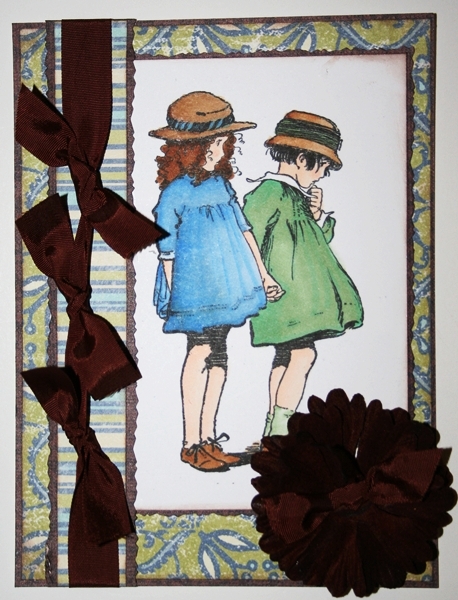
On the photo below I used :
PC 1016 Deco Aqua & PC 992 Light Aqua
PC 921 Pale Vermillion & PC 1032 Pumpkin
PC 940 Sand & PC 942 Yellow Ochre


To begin blending dip your stump into the OMS for a few seconds, allowing the stump to absorb it.
Once it is absorbed, begin gently rubbing the darker area's in circular motions if the area is large enough.  After a few seconds the OMS on the stump should begin to break the color down and allow you to pull it toward the lighter areas, blending the 2 colors together.  Some people use more noticeable highlights.  Often mine blends together and the difference is not to noticeable on photo's, but enough for me in real life to make be happy.  Play with the shading and find what you like.


Sometimes I like to add Shimmerz to mine, it gives the color a finished look with a slight shimmer.  It darkens/deepens the color a little as well.  This sample didn't turn out as well as I would have liked, but I didn't have time to redo it.  Hopefully this is enough information to get your started.  I know you will continue to learn as you practice.  As far as using the OMS with digitals goes : I use Epson ink and bleeding is not a problem for me unless I rub too hard.  Remember the OMS is supposed to do the work, so you shouldn't have to "scrub" the color.  If it is a problem for your printer ink, try heat setting it or spraying the "Work Fixative" first.  That might help.   If you are not able to move the color, put your stump in the OMS again and asorb some more.  Use the sand paper to clean your stumps.  If I'm working on a large area I sometimes have to switch stubs or sand off some of the color to finish it.  So of the colors build up faster on the tip and become harder to blend, so you have to clean some of it off before continuing.


You can see the difference in shading in the following previously colored images.


I would love to know if this tutorial is helpful to you.
Have a great day!!

You can see all of my Prismacolor Tutorials HERE.

Sunday, January 17, 2010

Designing with Vintage Images / Stamps


Do you love vintage images??

Well then you want to check out the Digital Two for Tuesdays Challenge Blog.
Cora loves them and she spends time searching for them, repairing them and then sharing them with the rest of us.  Cora uploads 2 images weekly and challenges us to use one of them.  It's free to download them, and use them for your personal use.  Cora just trust that you will not post the image anywhere else and that you will link back to her since she is the owner of the image.  I played along one other time and created the Snowman project at the bottom.

Here are 2 cards using this weeks image and  one of last weeks images.
Cora also sells some really great vintage stamps.  I just ordered a set from her Etsy store and I can't wait to get them!  Here is a link to her ETSY STORE.

You can find the image on card #1 to copy and print HERE.
You can find the image on card #2 to copy and print HERE.


I used Epson ink to print these and then colored with my Copics without any problems.


This one I posted in my March of the Snowmen Blog Hop.  So you may remember it from there.  The image was posted on Digital Two For Tuesday back on December 1.

Wanna see what other projects I have created with Cora's free digi's??   Click HERE.

You can view more of my Vintage / Shabby projects HERE.
You can view more of my Winter projects HERE.
You can veiw more of my Corrugated Cardboard projects HERE.
Related Posts Plugin for WordPress, Blogger...